Geographic information systems (GIS) are used in international development to layer information on who is funding what and where with data on development indicators such as poverty levels, presence of conflict, or population density. GIS is an extremely powerful tool that can be used in many disciplines to capture, analyze, and display geographically referenced information. Gender studies researchers are beginning to see the value of geospatial data, but what if we created a gender-specific data layer for wider use?
Prominent feminists are now experimenting with GIS to visualize gender differences in maps. Sandra Brown explores how spatial differences in road access, water access, and market distance affect workload and gender application. Brown states in her study that maintaining “spatial integrity in socio-economic data permits a deeper understanding of socio-economic interactions.” Meizen et al similarly argue that “gender mapping is an important step [towards] greater awareness of diverse gender roles.” Pavlovskaya & St. Martin believe “one goal of the feminist project is to eliminate socially constructed gender inequalities.” A gender-specific layer of data could help researchers and policymakers better understand and analyze those inequalities.
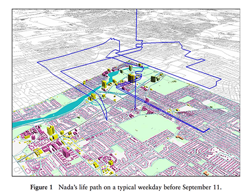
Mei Po Kwan, in her article “From Oral Histories to Visual Narratives: Representing the post September 11 experiences of Muslim women in the USA,” shows three images depicting fear that a Muslim woman, Nada, experiences before and after 9-11 while living in Columbus, Ohio. Kwan shows the spatial location of her life path, while the colors of the lines show her fear level. In image 1, we see that her fear level (blue) is relatively low while she has a wide life path around the city. On the day of September 11, her life path shrinks to one vertical line while she remains in her residence, but the image color changes to red, signifying extreme fear (Image 2). A few weeks after 9-11, her life path returns to normal spatially, while her fear levels fluctuate, turning red, green and blue. The three images use GIS technology to create a new visual connecting human emotion and geographic location.
In these examples, GIS proves to be a powerful tool when attempting to analyze relationships between gender and other factors. While the data works in these studies, a few gaps exist that prevent the creation of a gender-specific data layer. Not knowing how to analyze things in GIS and the limited availability of gender-specific data are both major obstacles. Researchers in the field are working to overcome these barriers.
Meinzen proposes an aggregation of survey household data to obtain the gender-specific information needed to make the data layer. A survey like this would ask females about their involvement in the workplace and household. In order to collect this data on a large enough scale for analysis, gender questions need to be integrated into the national census of specific countries. Another option is to hold expert consultation workshops, bringing together scholars in gender and other fields to discuss the role of women at work and at home in different countries. This method, when previously employed, led to in-depth analysis of gender and agriculture in Ghana. While effective, it is also time and resource intensive.
GIS has the power to aid and influence international development work by combining different datasets into one visual image. While there is a lack of gender data readily available for spatial analysis, awareness of the issue and demand for data will bring necessary information forward, with the goal of putting gender on the map.